


As you begin strategic planning for Autumn Term, you may want to dig into your data from the last three years in order to shape your new improvement plan. Arbor’s out-of-the-box dashboards make this easy, helping you quickly access meaningful data so you can make the best decisions. You can drill down into key attendance, behaviour and attainment metrics and easily spot useful patterns, all without the need for any special training (and no need for a complex setup process!).
We’ve been working with schools and MATs recently who want to customise how they analyse and visualise their data even further using BI (Business Intelligence) tools, such as Microsoft Power BI, Google Data Studio or Excel. We make it easy to export your Arbor data securely into BI tools if you want to, so you can dig even deeper into your student measures.
Using BI tools are great for:
- Driving strategic planning by bringing data from your MIS, HR, and finance systems all into one dashboard
- Exploring contextual factors affecting your performance by bringing in other national and regional data sets, such as GIAS (Get Information about Schools), IMD (Index of Multiple Deprivation) or crime statistics
- Visualising your data in new ways – choose from lots of different chart and graph options
How to create a custom BI dashboard – an example
So what does using BI look like in practice as a MAT? Andrew Mackereth, Arbor Senior Partnership Manager, caught up with Empower Trust in Shropshire about how they created a custom dashboard in Google Sheets using their Arbor data. Find out why they wanted to create it and how they built it in five easy steps below.

3 things they wanted to achieve
1. Share information with the Board
As the Board of Trustees is accountable for the performance of the Multi-Academy Trust and its Academies, a key issue for Ian Nurser, Empower’s CEO, was to provide them with a breadth of accurate, timely information across a range of key performance indicators (KPIs). This would allow the Board to understand the trust’s strengths and development issues, assess progress and review future risks and priorities.
Pulling everything into a single live dashboard would give the Board a single source of truth. At each meeting, the data would automatically refresh, updating the current picture, or monthly/termly trends at the same time.
2. Make sure everyone has the same information
It was important to Empower that the CEO, the Trust School Improvement Officers and local governing bodies (LGBs) had access to the same Academy-level information to allow them to question, support and appropriately challenge Academy leaders to build on their strengths and continually improve.
3. Bring together a range of live data sources
Empower wanted to bring together real-time information across a broad range of KPIs including attainment and progress for all year groups, pupil attendance, exclusions, SEND, safeguarding and staff absence (as an indicator of staff wellbeing). Using Google Sheets would enable the reports to automatically update as each Academy entered data.
As well as providing real-time information, they wanted to increase efficiency and save leadership time by compiling the content for their termly CEO and Headteacher reports to Trustees and LGBs automatically. They also wanted this information to be available to other groups of Trust and Academy staff such as SENCos and EWOs, so they could better monitor SEND, attendance, staff wellbeing, etc.
How they built their custom dashboard
Empower took the following steps to plan and build their Google Sheets dashboard:
1. Agree the data they want it to show
2. Find the sources of the data
3. Plan the structure of the dashboard
4. Export the data they want from Arbor
5. The dashboard is ready and will refresh automatically!
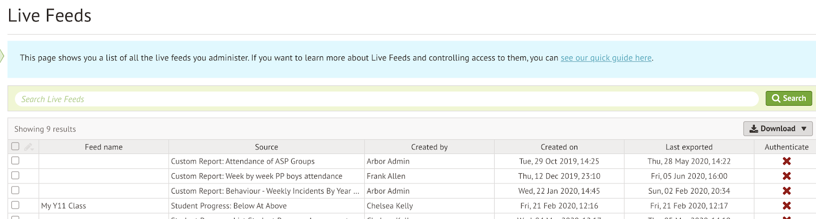
The main process involved in creating a dashboard in Google Sheets is exporting data sets from Arbor using “Live Feeds”. Empower pulled the majority of their data from the data tables in Arbor and the other information (such as the number of days of absence caused by holiday) using Arbor’s unique Custom Report Writer.
For each data set (table) they wanted to export from Arbor, they created a “Live Feed” for it, then inserted it into their custom dashboard using the Google Sheets add-on. Then they selected the graph type they wanted to use to illustrate the data (like the bar chart below).

Ensuring the data is secure
It’s important to be confident that your data is safe when you export it out of your MIS. That’s why in Arbor you can add authentication to your “Live Feeds”. This means that anyone accessing your new custom dashboard (whichever BI tool you create it in) must enter a password. You can also track when each Feed was last accessed. Read more about how Arbor keeps your data secure here.
Visualise your data however you want to with Microsoft Power BI
Microsoft Power BI is becoming a popular tool with School Data Managers for creating custom visualisations of their MIS data.
This year, we launched a brand new Microsoft Power BI Connector which pre-loads your key Arbor data into Power BI, allowing you to explore it further in creative new ways.
We’ve also created five ready-to-go template dashboards which will save you hours of manual set-up, and allow you to dig into key factors behind your school or MAT’s performance. Plus, they’re fully customisable, giving you the freedom to present your data how you need to.
Check out the top five ways to use Microsoft Power BI as a Data Manager from expert Ed Cadwallader.

Want to find out more about Arbor MIS?
If you’d like to find out all the ways Arbor could transform how your school or MAT works, join one of our free webinars this term to see the system in action. Looking forward to meeting you online!


Leave a Reply