


By School Improvement Consultant, Ed Cadwallader
Since I started my career as a School Data Manager nearly 20 years ago, I’ve seen a lot of EdTech come and go. In some areas there have been impressive advances – Arbor MIS, for example, has analytics features that are light years ahead of anything SIMS could offer.
Luckily though, Management Information Systems (MIS) haven’t just been improving their in-built analysis tools, the best ones are also opening up secure data feeds to allow you to export your MIS data and analyse and share it exactly how you want to.
What is Power BI?
Arbor users can connect secure, customisable data feeds to visualisation tools including Excel, Google Data Studio or, my favourite, Microsoft Power BI. Power BI is enterprise grade business intelligence (BI) software that lets you combine and analyse data from multiple sources to create interactive dashboards and apps.
Of course, as a busy Data Manager or School Leader, you don’t have bags of free time to learn new software, so I’ve put together five of the top things you can do in Power BI so you can see if it’s for you.
Top 5 ways to use Power BI
1. Customise! (without the pitfalls of Excel)
As a Data Manager, I used to share screenshots of reports with SLT, but I would often get asked lots of basic questions, such as “who is this 20% of Year 9?” I would reply with a static student list that was accurate on that day but would soon be out of date.
You could solve this by using Excel, but this comes with a host of other problems, such as users typing over formulas, changing underlying data and sharing outdated versions.
Microsoft Power BI gives you all the benefits of Excel without the drawbacks. You can combine data from your MIS, online assessment tools and spreadsheets to produce the Key Performance Indicators (KPI) that matter most right now. For example, if you’ve got an initiative around punctuality, you could add the start date onto a graph of lates to see if it made an impact.

2. Focus on what matters
The best MIS systems or analysis tools give you an overview of the big picture while also allowing you to zero-in on the key data points and see the students behind the numbers.
Power BI lets you do just this. You can arrange multiple tables, KPI index cards and charts on a single page, then “drill down” into any of them to see the list of students behind the data. Hovering over a chart will also give you useful context, helping you take the best course of action.
If you spot a problem in a particular year or class group, clicking on that data point will filter the rest of the page by that group’s data. This would allow you to see, for example, if a spike in behaviour incidents within a year group has led to an uptick in exclusions.

3. Take action
Unlike Arbor, many MIS systems don’t allow you to take action directly from your analysis. This means you might be carrying out your analysis and communicating your plans via different channels which can lead to people misinterpreting information and a lack of shared purpose between staff.
Power BI’s web portal gives you a shared online space where your stakeholders can analyse, plan actions and carry out on-going reviews of interventions, all in one place. You can comment on specific pages and tag colleagues to bring data points to their attention.
Alternatively, you can share a dashboard in a Microsoft Teams chat so that a group of staff who are working towards a specific school improvement goal could use live data to inform their efforts.
4. Empower SLT to explore data themselves
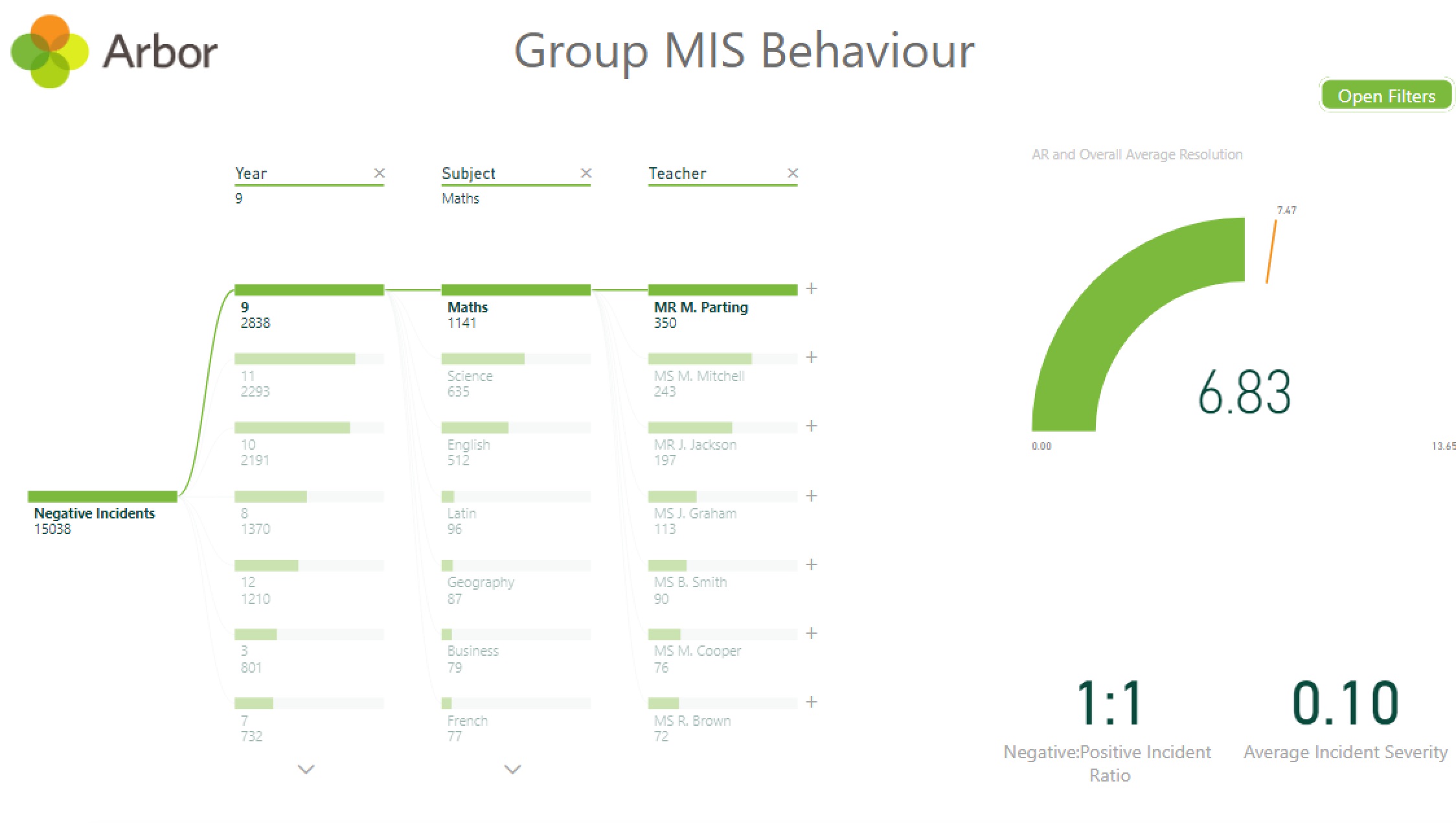
Not everybody can work with a big table of unstructured data. But when you turn raw records into visuals, you might inadvertently present the problem in a biased way. For example, if your school has seen a spike in behaviour incidents, breaking the data down by either year group, subject or time of day might imply one of these factors is behind it.
Power BI’s “Decomposition Tree” is an elegant solution to this problem. This visual allows you to choose from a list of factors that might affect a measure (such as number of negative behaviour incidents). You can change the order and number of break-downs, either choosing a specific category or one that Power BI has calculated to have a large effect. If a line of investigation leads to a dead end, you can remove, rearrange and look at your data in a new way.
You can also cross-highlight; in the example below, where the user has chosen to break the data down by year, subject and Teacher, selecting “Mr M Parting” shows you that his incidents are resolved slightly faster than the overall average but that a far higher proportion of them are negative compared to the school as a whole (1:1 when the overall ratio is 1:4).
5. See your data in new ways
The flexibility of Power BI allows you to explore data from your MIS in different contexts. For example, using the map visual, you can plot your students by their home postcode to see if their location correlates with attendance or punctuality issues. You could also create a heat map showing days of the week and AM/PM sessions to see if particular times in the week see higher or lower attendance.
This is another way you can tailor your data analysis to your top priorities, which is more important than ever during Covid-19. With so much disruption to accountability measures because of missed exams, being able to bring in other data sources into your analysis allows you to stay flexible and self-sufficient when it comes to monitoring your school’s performance.

Getting started with Microsoft Power BI
The most important thing to remember about Power BI is that it’s a tool not a solution. While licences are cheap at around £20 per year, the platform isn’t pre-programmed to cater to all of your data needs, you need to create your own data model and dashboards. This requires a considerable investment of time, both to learn the program and create the content.
The good news is there’s a friendly and growing community of school-based BI developers on Twitter, free tutorials on YouTube and a dedicated blog, Power BI for Schools.
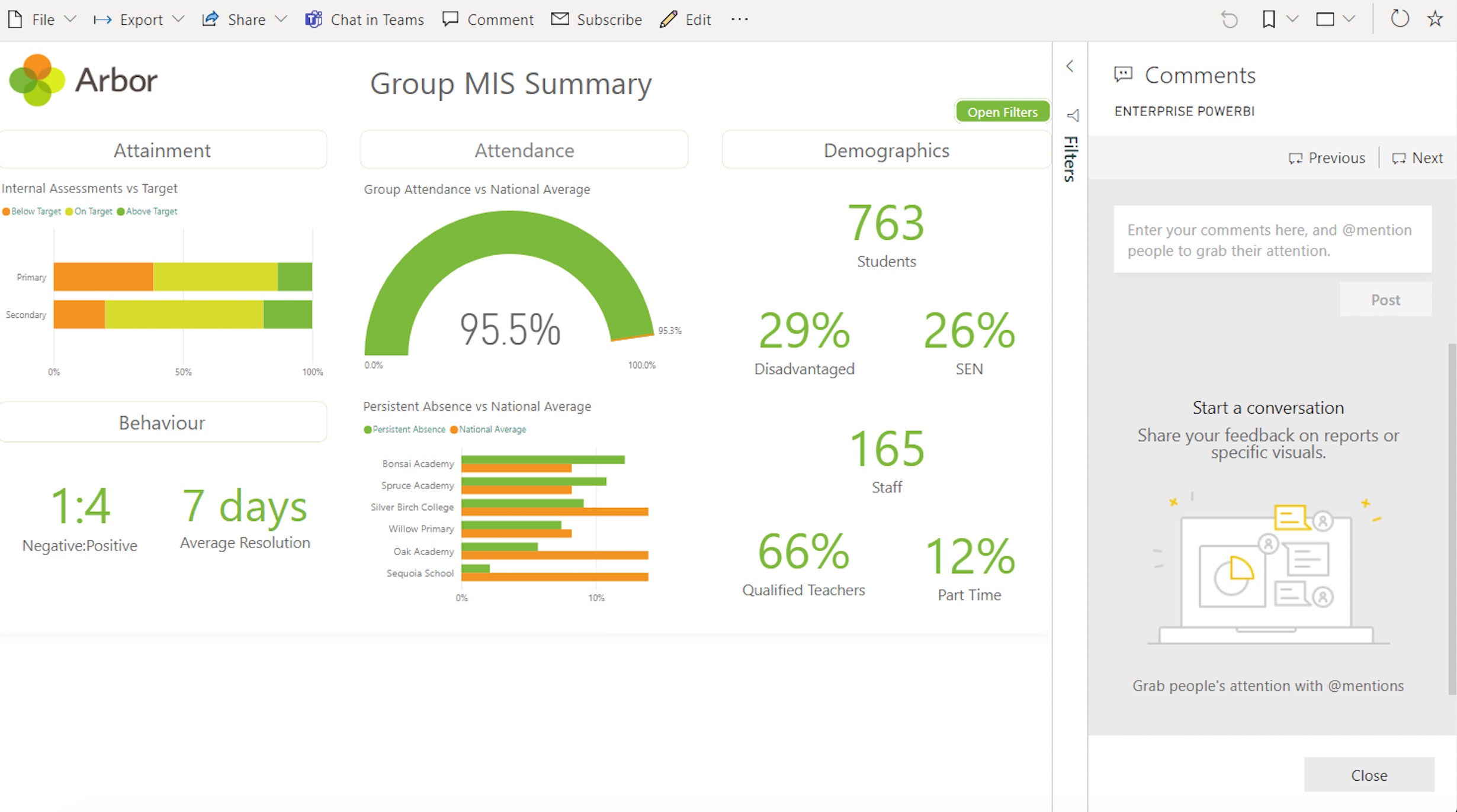
Seamless connection between Arbor and Power BI
Arbor gives you sophisticated out-of-the-box dashboards and easy custom reports at school and MAT level, designed to give staff at all levels a shared view of progress.
Arbor has also created a Power BI Connector and five report templates helping you to visualise Arbor data any way you want to.
To find out more, join me for a Power BI masterclass webinar during ArborFest – Arbor’s virtual conference exploring innovative ways of working 18-19th March.
Power BI Masterclass, 18th March, 2pm
Book your free spot


Leave a Reply